Undergraduate Thesis Makes Triumphant Return to SCI-Arc Campus
SCI-Arc’s 2022 Undergraduate Thesis class celebrated the culmination of their B.Arch studies with an in-person return to campus. Held April 22-23, this year’s Undergraduate Thesis Weekend was abuzz with crowds spanning SCI-Arc’s renowned halls, flocking from one group review to another throughout the two-day event, as students presented and received invaluable feedback on their extraordinary final thesis projects from architecture experts, SCI-Arc faculty, and visiting scholars.
For 50 years, since its founding in 1972, Undergraduate Thesis at SCI-Arc has been an integral, celebrated event throughout the school’s history. Each year, SCI-Arc’s fifth-year B.Arch students present their completed projects during an immersive Undergraduate Thesis Weekend, a public platform during which over 70 jurors, critics, and architecture professionals converge to discuss, debate, and dispute emerging questions in architecture. In their final semester of design studio, SCI-Arc’s 2022 Undergraduate Thesis class completed the production of a year-long thesis project, which addresses a position in relation to contemporary architectural discourse and presents a highly developed building design project.
The differences perceptible in this year’s UG Thesis extended further than the noticeable lifts and shifts in excited energy as visitors, faculty, and students moved through the space over the weekend. “Returning to an in-person Undergraduate Thesis was also a major component in the way the students explored their projects this year—they learned in person, but also from one another, in ways that digital teaching doesn’t always allow,” notes 2022 Undergraduate Thesis Coordinator Maxi Spina. “SCI-Arc’s focus on architecture as a material and spatial practice means the emphasis on models, prints, and drawings is critical. All physically based decisions connected to the way students made their work this year was much different than in previous years—from the quality of the paper the students used to print down to the way the models were painted.”
“We like to say that these guys went into remote in third year and came back to thesis in fifth year with ideas of what their thesis would look like,” adds Spina. “They didn’t have the conditions to produce what they wanted so they came back with a vengeance, bolder and stronger than they would have been.”
Not only did the return to physical space dictate how students tackled the physical elements of their projects, but uniquely how they considered the conceptual thrusts of their theses as well. For example, this year, alongside museological questions, students explored projects that had to do more with adaptive reuse and social housing in Los Angeles than ever before, which have been more prevalent concerns due to the pandemic and widening income inequality and housing scarcity in the city. “Thesis at SCI-Arc is unique in that students need to think about their projects conceptually and historically and they need to produce an argument or a position in dialogue with ideas that ends up being embodied within an actual site and a proposed program,” explains Spina, “so they need to be able to embrace “both/and” thinking—a quality of engagement that is as contemporary as it is architectural.”
SCI-Arc Director Hernán Díaz Alonso echoes Spina’s sentiment of optimism and reverence for this year’s graduating B.Arch class as they embraced both the challenges and transformative potential of their thesis this year amid the school’s banner 50th anniversary. “As we embark on another Undergraduate Thesis, we are reminded that our students and the extraordinary work they produce as members of a global society is why we are here; why we continue to strive for imagination, excellence, and architectural thinking—beyond the status quo.”
“These are times of evolution and renewal, and the creativity of our students represents a vehicle for the cultural shifts we need moving forward,” comments Díaz Alonso. “If their time at SCI-Arc has shown us anything, it is that they have the will, the desire, and the ambition to make a better world. As they move through their Undergraduate Thesis and out into the professional world, we look forward to watching them grow into the kinds of leaders they want to be.”
Several noteworthy 2022 Undergraduate Thesis projects are included below.
Piyi (Phoebe) Yao and SinChuen Cheng
Attack on Figures
Advisor: Maxi Spina
@sin__chuen
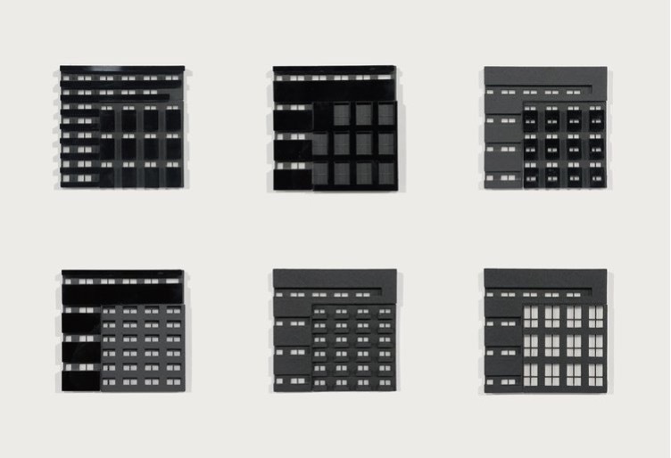
Our thesis looks at multiple notions of densification through the framework of figuration that allows horizontality and verticality to operate as simultaneous growth patterns adapting to different programmatic needs within a single urban assemblage. To navigate through this idea, we situate our thesis in downtown Los Angeles and test the idea of using the concept of densification visually and functionally both to represent the problem of density and to accommodate real urban requirements.
As the global population and urbanization increased rapidly since the nineteenth century, cities started to densify themselves by expanding either horizontally to cover more land for human living or vertically in those areas where the economics and activities happen the most. However, the singularity of either of the growth pattern is problematic, where the horizontal way of expanding the city will eventually lead to a lack of land and an excessive occupation of the natural environment, while the vertical way of densifying the city brings up oppressive and stressful emotions when being surrounded by concrete forest but lacking sunlight, air, and green space. The density of the architectural elements, such as balconies, windows, stairs, etc. especially shown in the residential program has also caused a visual problem brought by its overwhelming effect. This thesis realizes those problems as well as the opportunities within it and therefore attempts to transfer this notion of densification into an idea as well as a technique that can be applied architecturally through figures in multiple ways with multiple layers of meaning, using large projects for big intervention to not only experiment with expanding the city horizontally and vertically at the same time but also allow the understanding of densification and the harmfulness of the densification to happen and to be digested from a different perspective.
Esin Karaosman
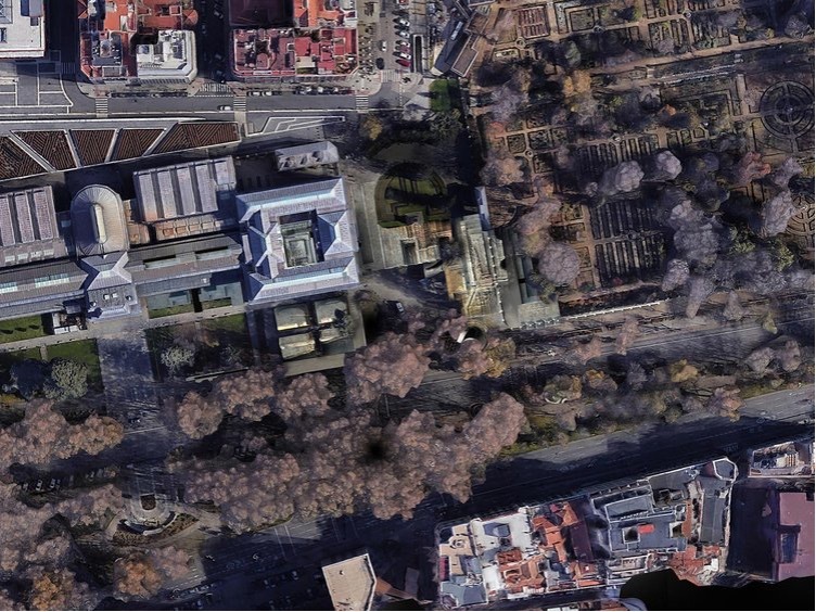
Wall, Hall, Dust & Rust: Prado’s “Critical Zone”
Advisor: Maxi Spina
@esinkaraosman
In the contemporary world, there is a problem of preservation beyond the maintenance of material conditions. This in and of itself is a mystery because it is tantamount to a freezing of time and entropy. However, there is an even more enigmatic problem of preserving the images we associate with history. Representations, constructed social meanings, and intellectual categories are ultimately the most valuable things to concern. It is as much an optical problem as it is a material one.
It is apparent that the crack between what things are and how they appear to us becomes visible through a literal crack in the walls of the Hall of Realms, the 17th century building which has been acquired to be used as an extension by the Prado Museum. In October 1993, the rainwater was seen filtering down through the cracks, the walls and the artifacts were decaying, how they appeared to us was changing: “The alarm bells went off, both in the building and in the media.” (2)
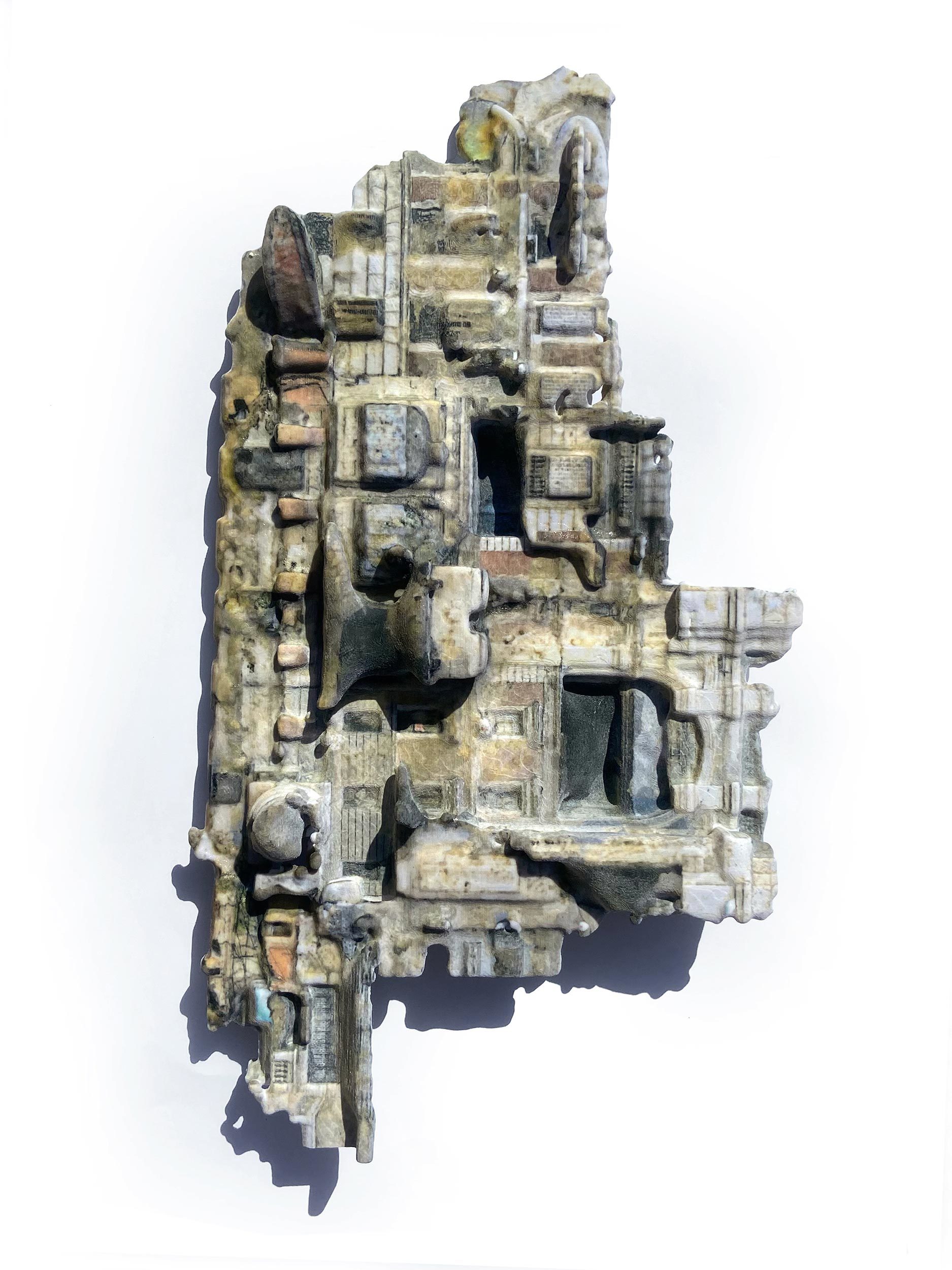
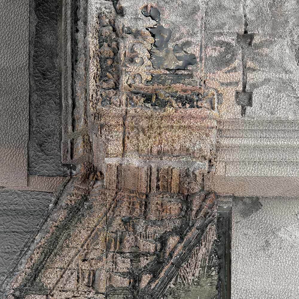
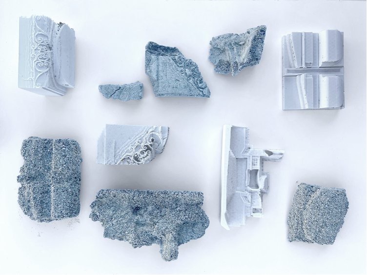
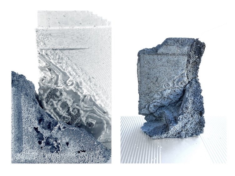
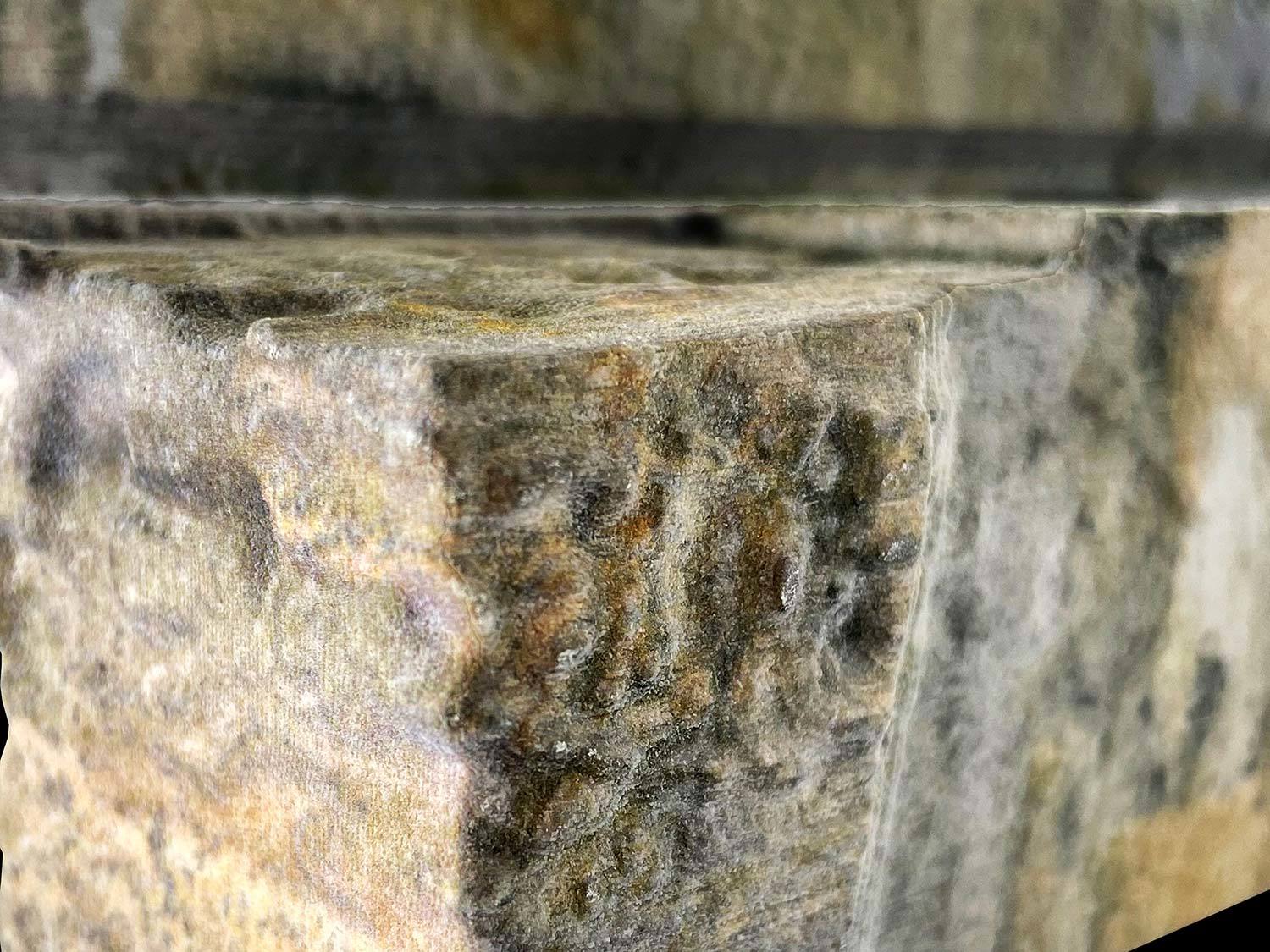
In reverse, this project starts with looking at things themselves, the walls, as how they appear to us today: Through their visible bodies, without their constructed meanings, with hyper-attention, through the lens of imaging technologies.
The design of the extension is treated in this project as an unusual kind of collage problem.
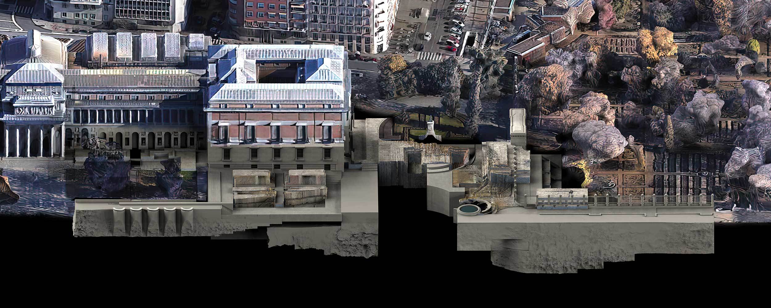
The existing walls no longer appear as solid boundaries but their photogrammetric scans merge into a thin, glitchy, fictitious body.
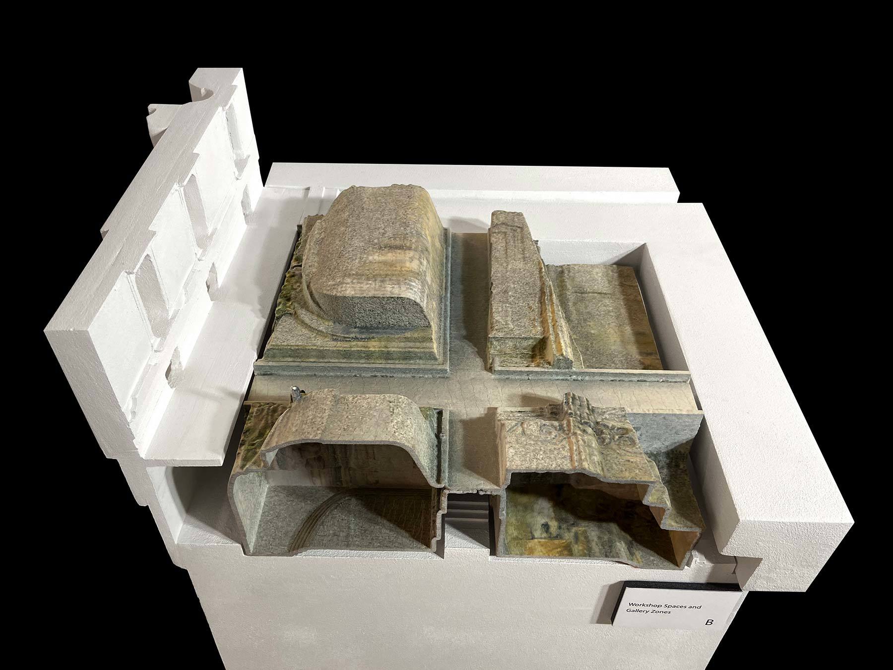
The space of the extension emerges by merging the found, fictitious body of Hall of Realms and the constructed grounds of Prado. The extension becomes the thickness where we move in-between, horizontally and vertically.
In these spaces, we no longer occupy the fiction that the palace and the garden constructs, we no longer pass through the walls and enter the touristic halls. We occupy the thickness and surfaces of them, and their new fictions.
As the extension doesn’t belong to Prado nor the Hall of Realms but stitches them, it also stitches the constructed seams and boundaries of the site; through mediating between the Prado Museum, the Botanical Garden, and the urban surface that we walk on everyday.
With this seamless collage, in the historically charged site of the Prado, Spain; what we see, and the images are no longer preserved, but their scanned bodies and resolutions are used to create a new synthesis in order to generate multiple meanings, alternative histories, and speculations for future physical, virtual, and material realities.
An unstable synthesis which will always be changing,
from a scale of a pigment, an algae, to a scale of satellite imagery.
A synthesis which alludes to the Hall of Realms, where we can never see it entirely, for the ones who are interested in history.
(1): “Critical” because it is far from equilibrium, because it is fragile. (...) “Zone” because it is still largely unknown; because it differs from what used to be called; because it has a topography very different from that of a planet viewed from space.”
Latour, Bruno. Critical Zones Exhibition. 2020.
(2): “In October 1993, rainwater was seen filtering down through the cracked, poorly maintained roof of the Prado Museum’s building. Alarm bells went off, both in the building and in the media, and the public learned what until then only a few insiders knew: that one of the best and most famous museums in the world had been in desperate need of repair.”
Ruano, Miguel. Prado Museum Competition: Chronicle of an Absurdity (1995/96). 2017.
Zane Mechem
Relearning Las Vegas
Advisor: Peter Testa
Research Dossier
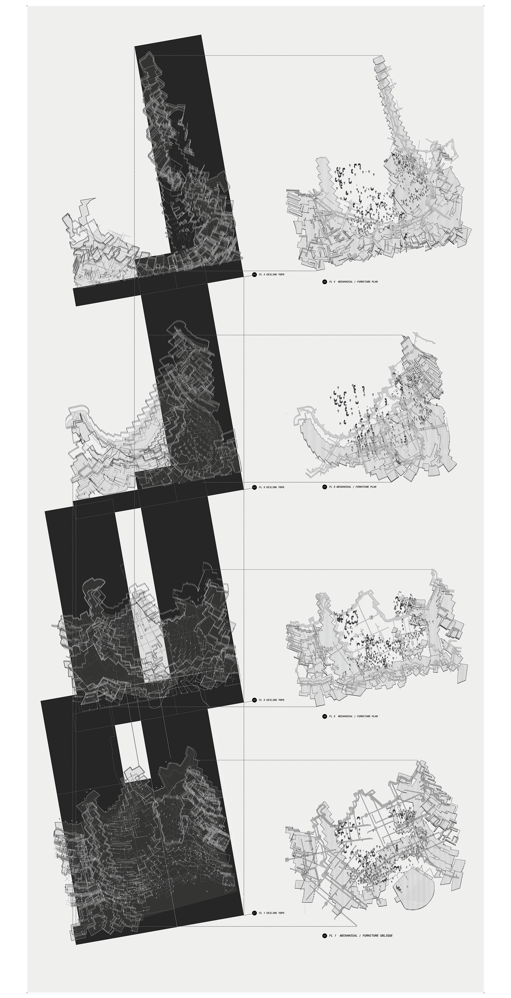
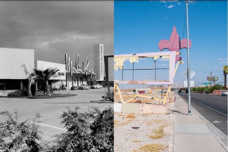
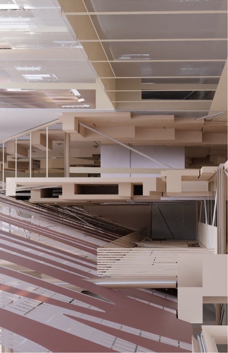
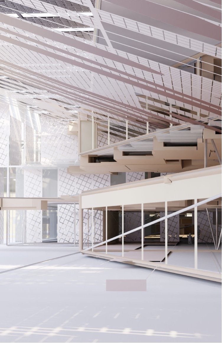
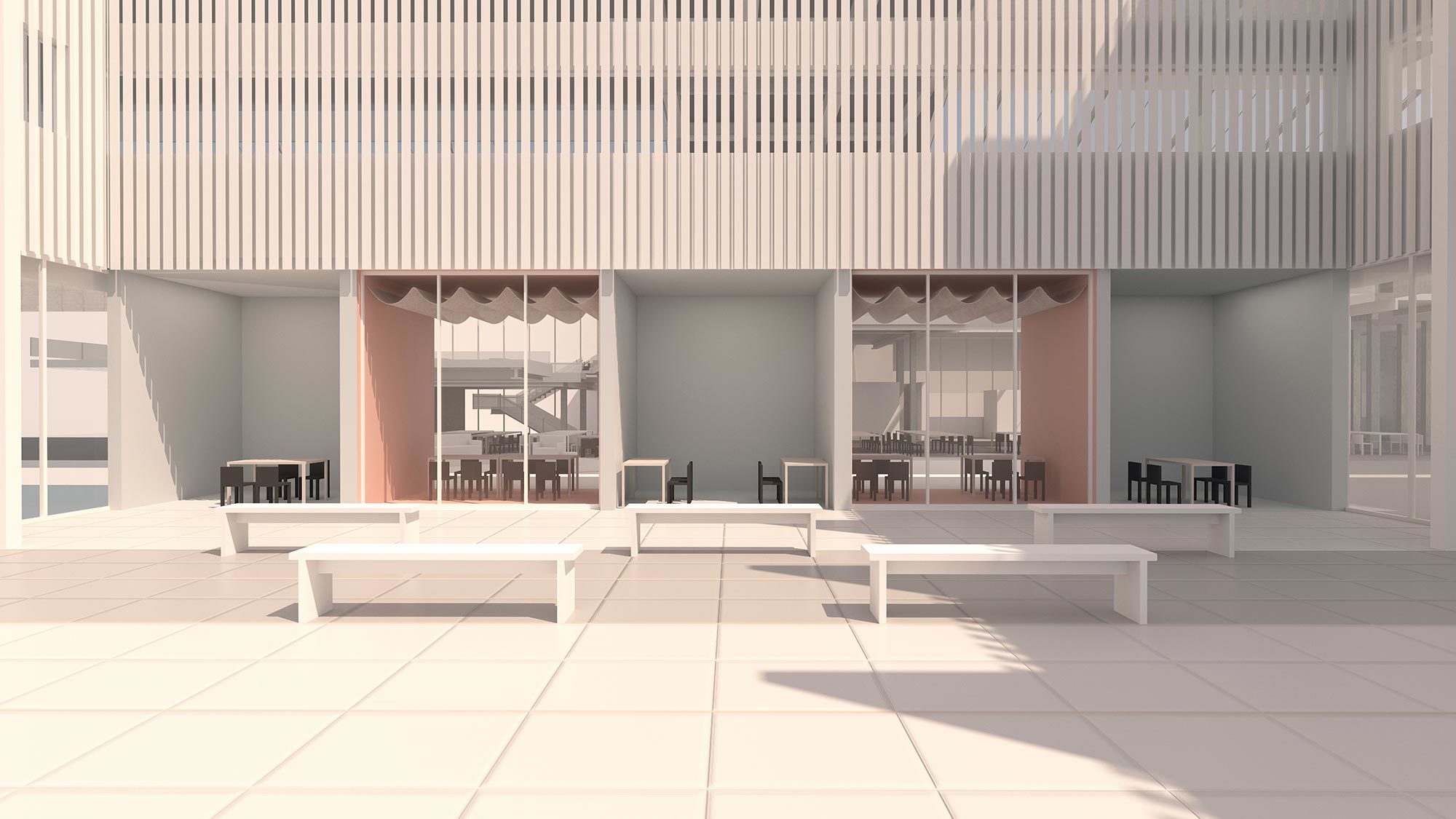
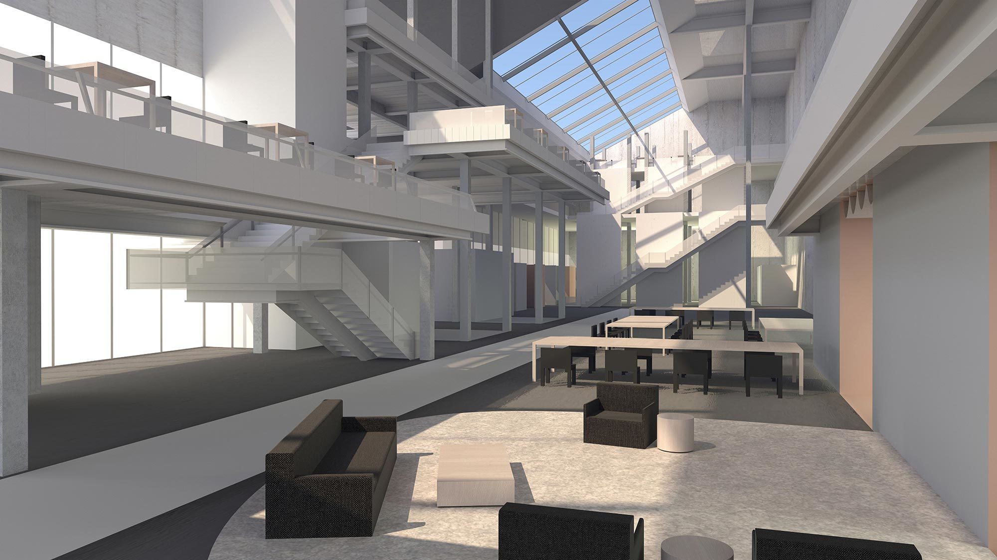
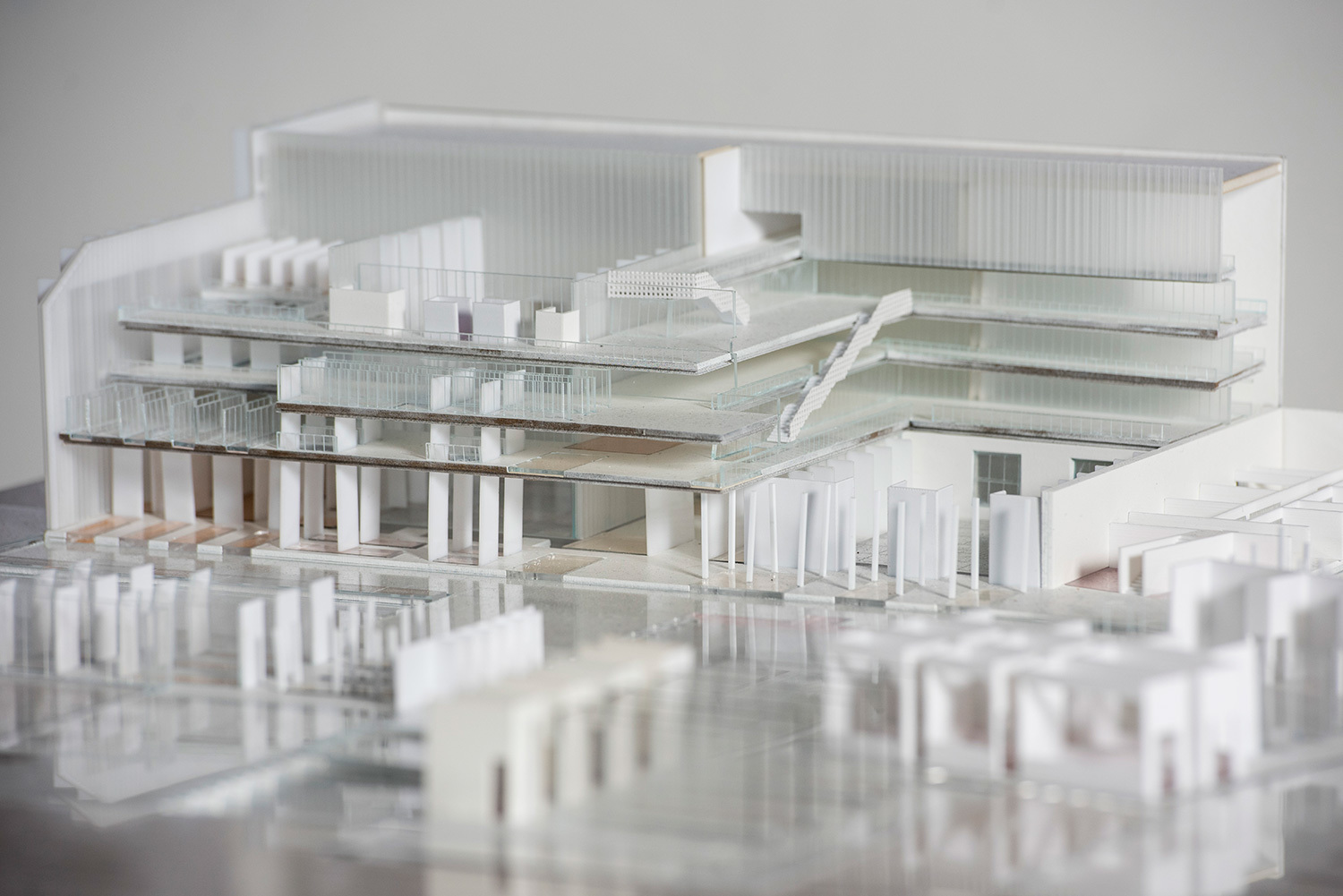
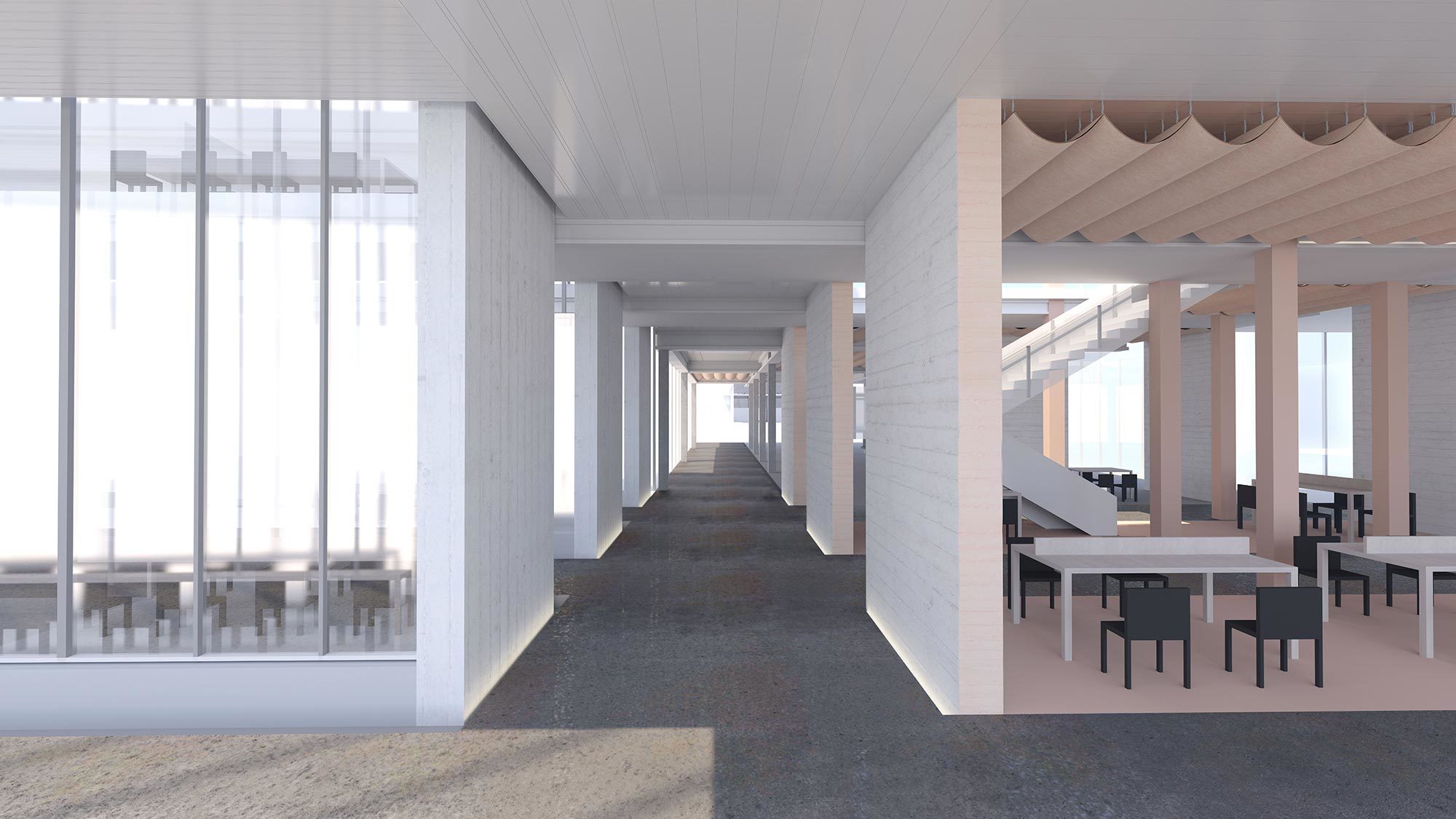
This thesis explores a proposal for a new contemporary library in Las Vegas, in which the interior disorganization and articulation of ceiling soffiting of casinos are reinterpreted and inverted to create a new method of organizing spaces for community. Grappling with Vegas’s history of redlining and exclusionary urban planning, the now empty site of Vegas’s first desegregated casino, the Moulin Rouge is an outlier in Vegas. It acted as a model for community engagement, an off-the-strip urban hub which drew its stakeholders from downtown as much as the historically Black Westside neighborhood. While Vegas is usually analyzed through the lens of semiotics and the exterior, by reexamining the interior and reappropriating methods of geometrical distortion which are typically used to keep casino-goers inside and unaware, a new system of interior layout for a new typology of library emerges outwards. In this, it maintains both the anti-promenade aspects of casino plans while suggesting a fundamentally different and more equitable programmatic intention. Borrowing strategies from casinos of complex ceiling soffiting with few walls, emphasizing boundary driven circulation, this thesis offers an new open ended approach to the typical box form customizable with an interactive interface, allowing options and input for customization to match a number of site variations and programmatic intentions. An analysis of mapping and geometrical reversals of this commercial typology, a courtyard-style 50s casino, allows a new way to structure internal organization of low and flat buildings, offering novel ways of seeing the city, and how it might unravel outward.
Lingjia (Adam) Wang and Yunbin Wang
Equivalent Volumes
Advisor: Kristy Balliet
@yun_bw
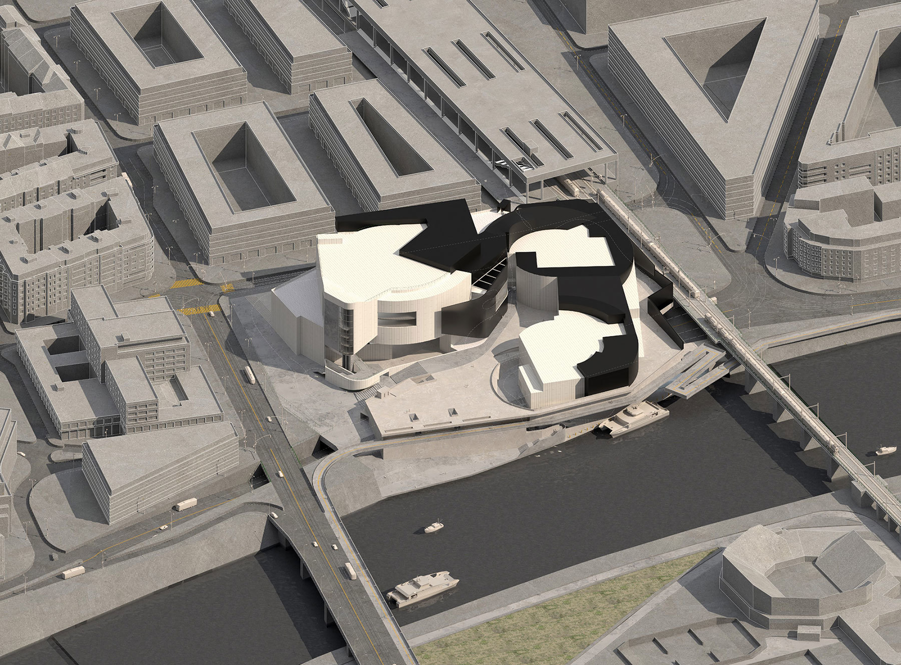
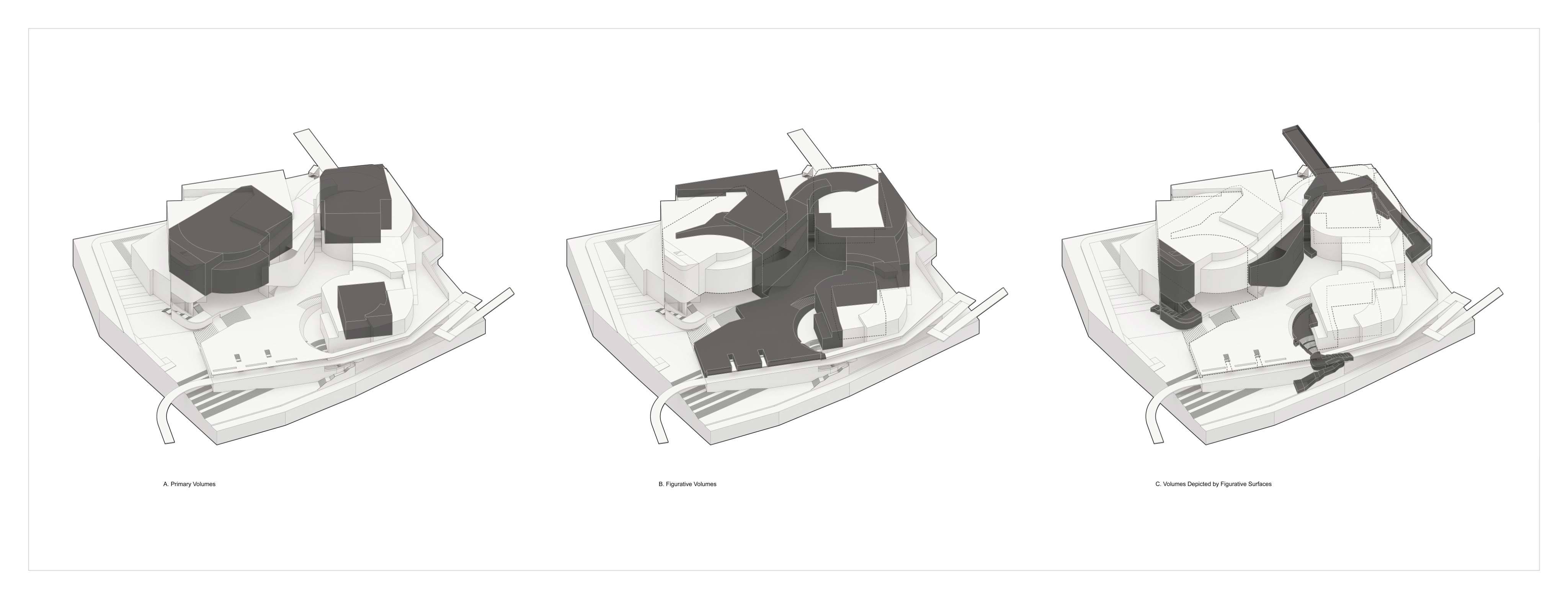
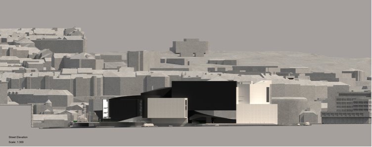
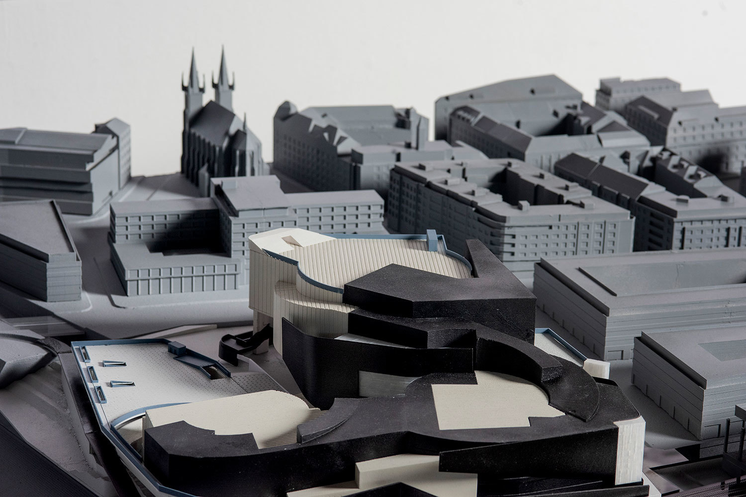
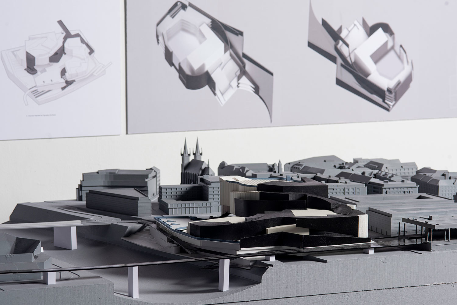
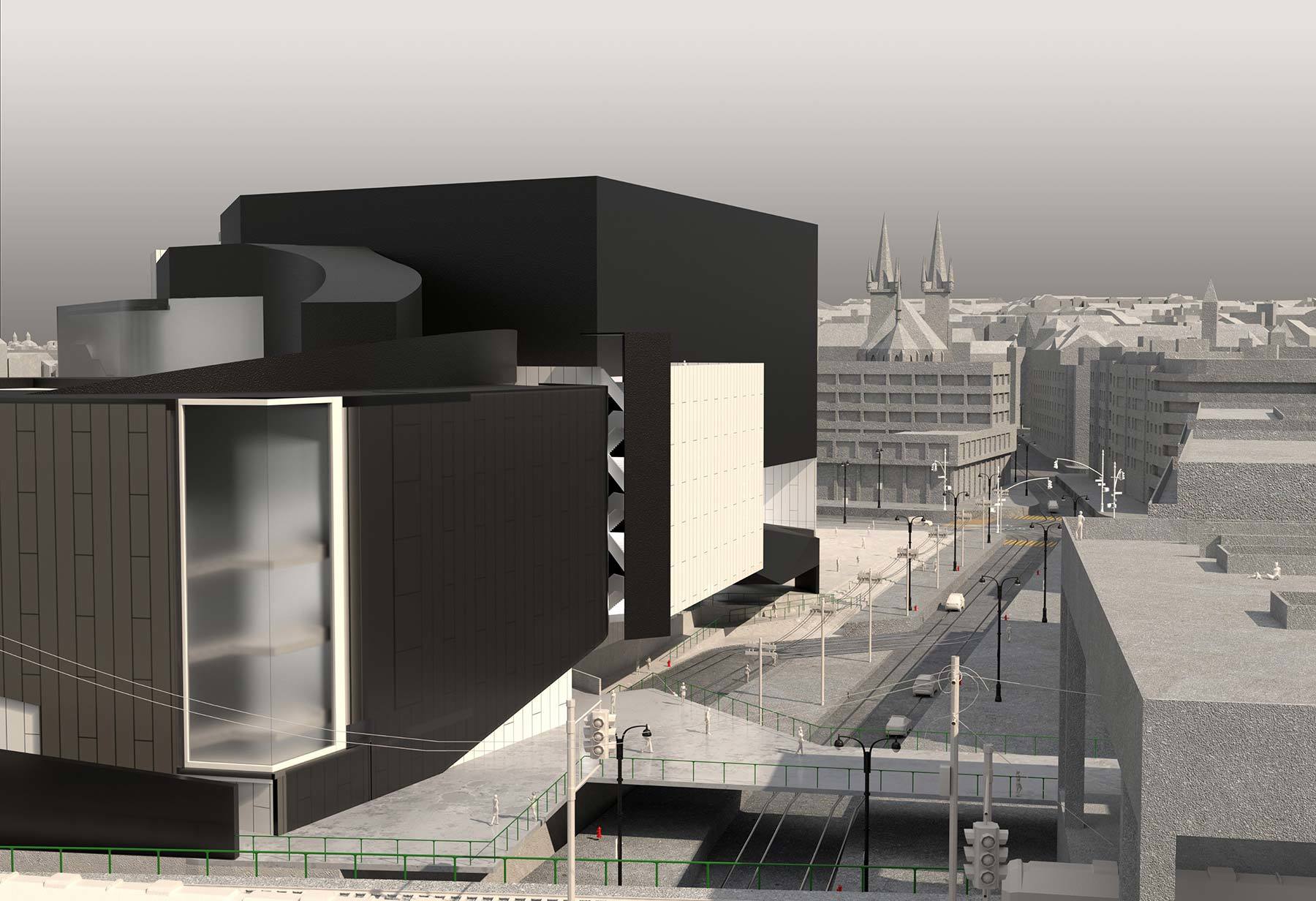
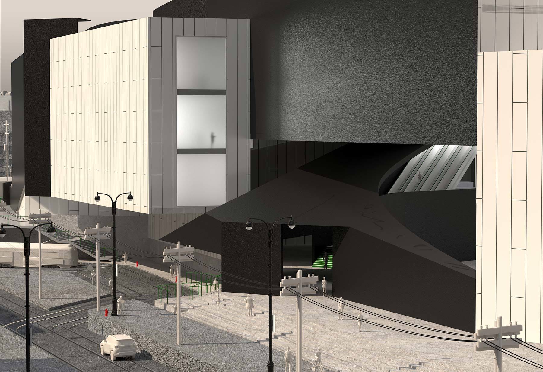
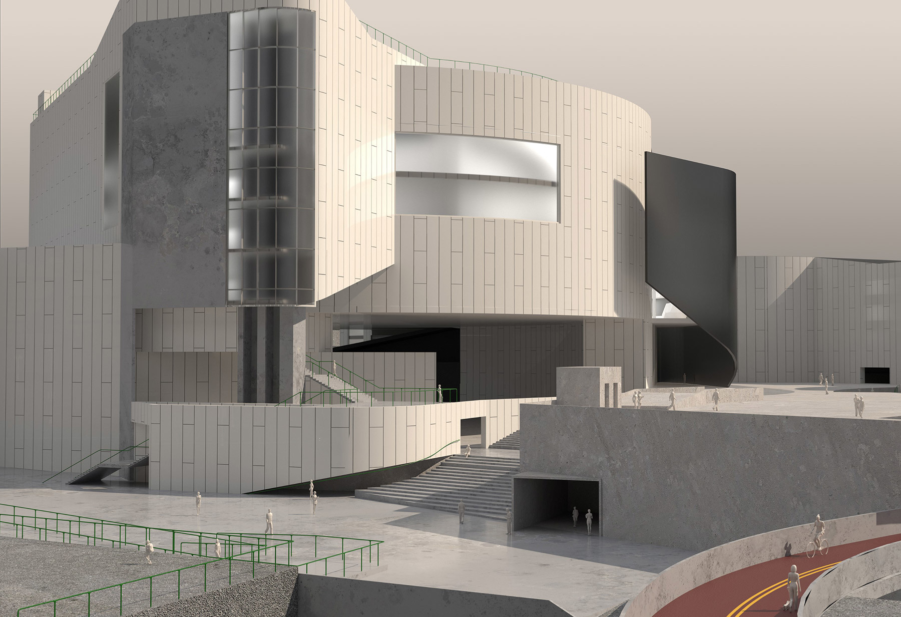
This thesis advocates for equivalent volumes that flatten the hierarchy of civic and cultural spaces. In this project, designed volumes interact and negotiate boundaries, diminishing individual qualities in favor of combined characteristics and configurations.
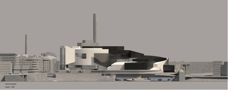
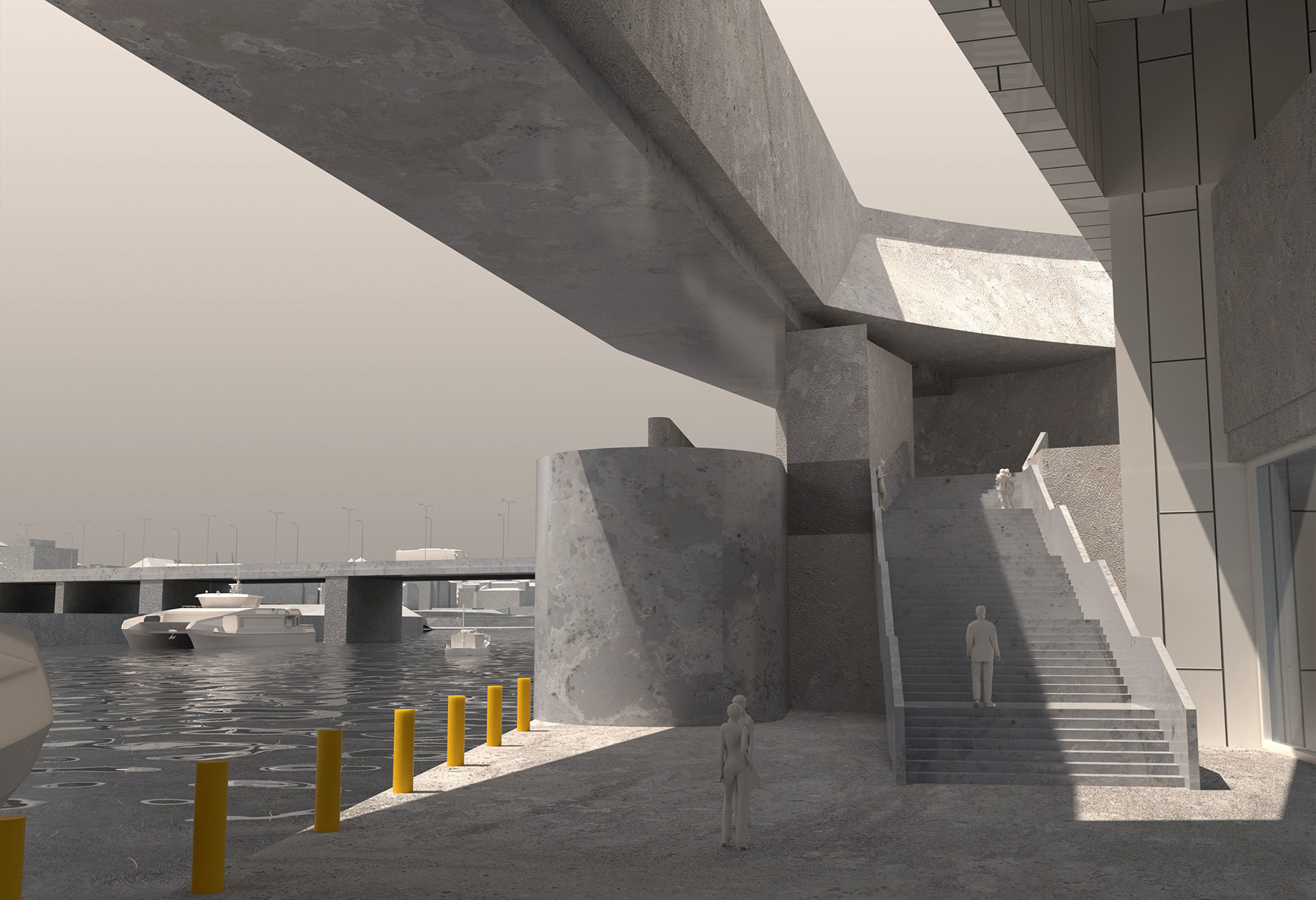
The project is a Philharmonic Hall located in Prague. The site, a new cultural center located along the Vltava River, extends the cultural and historic center while connecting to existing and new transportation infrastructure. The project lands in between these conditions and offers significant opportunities to test the thesis, including internal program and urban planning. A philharmonic program tends to center the primary volume (Hall), while support volumes (foyers, backstage, etc.) fill in the gaps. In this project, a series of figured volumes and surfaces are coordinated and balanced to define the building as well as the civic plaza.
Three elements are used to define the project. Primary volumes are balanced and coordinated with a series of figured volumes and surfaces that together define the building and integrated civic plaza. In this project, the figured volumes are pushed to the perimeter, not the de facto center, emphasizing and blurring the line between connector program and civic room. The project as a whole is a support system that connects the past, present, and future of the site to Prague.
Tamara Birghoffer and Kendall Man
What Difference Does It Make?
Advisor: Russell Thomsen
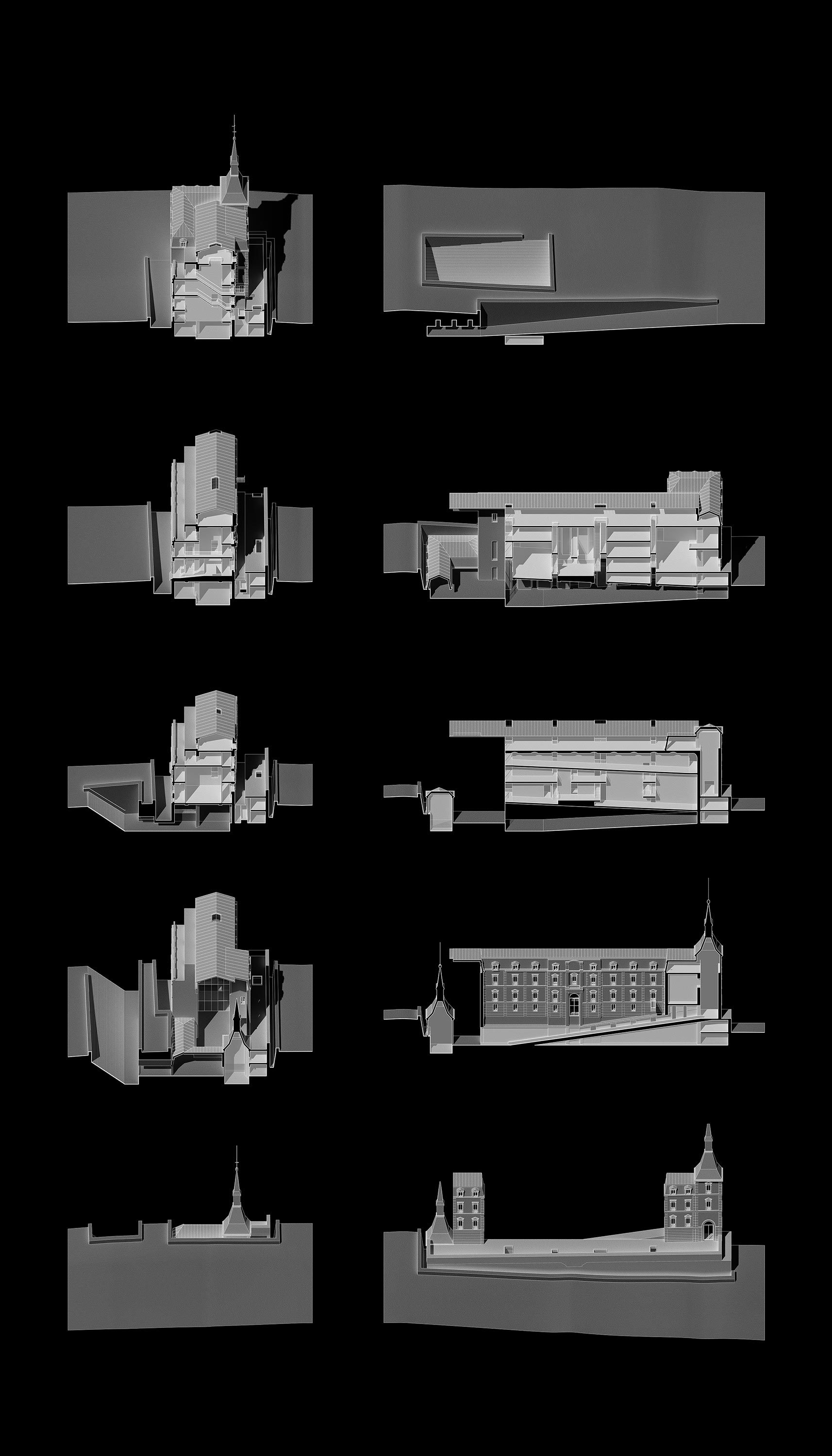
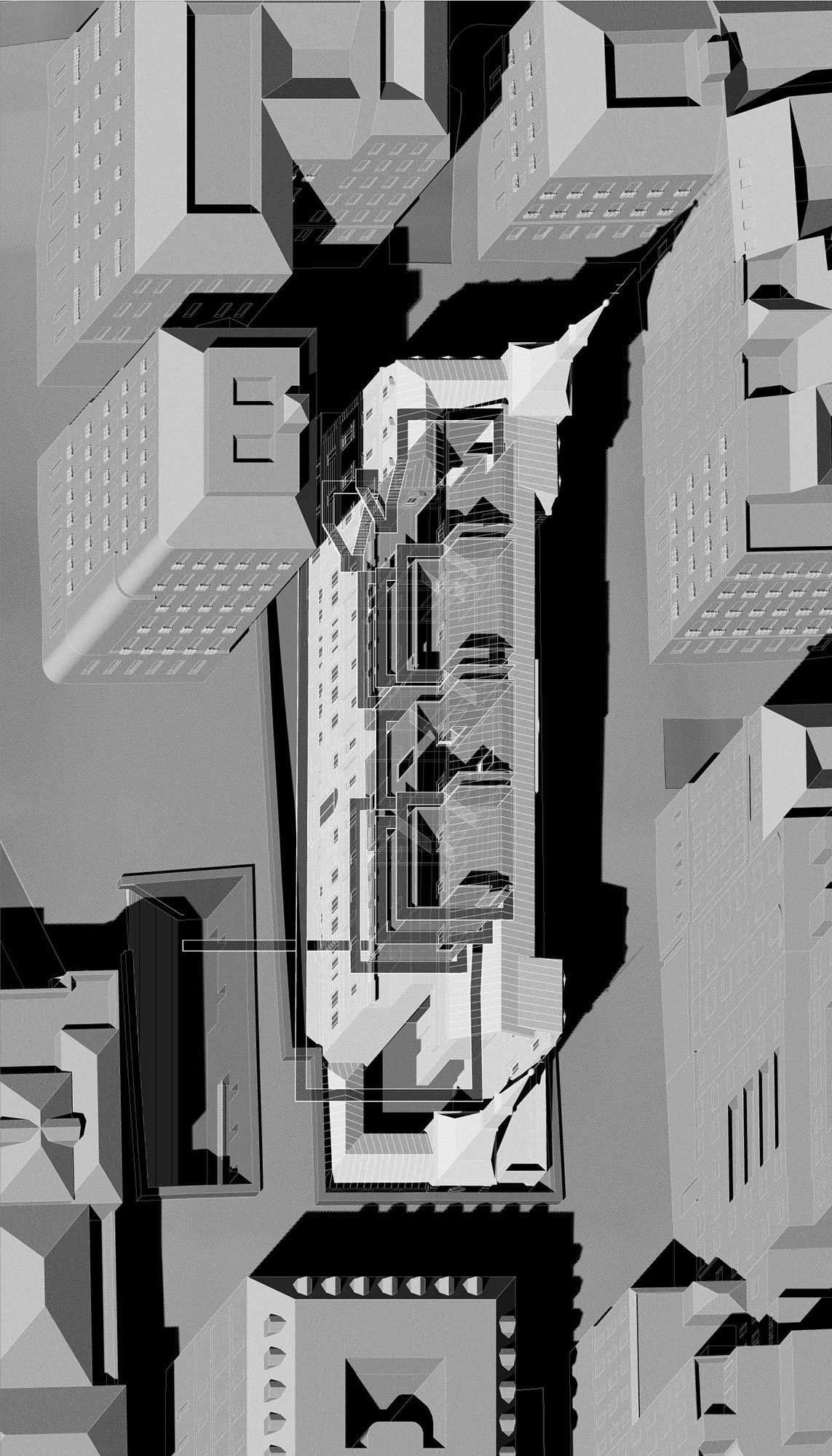
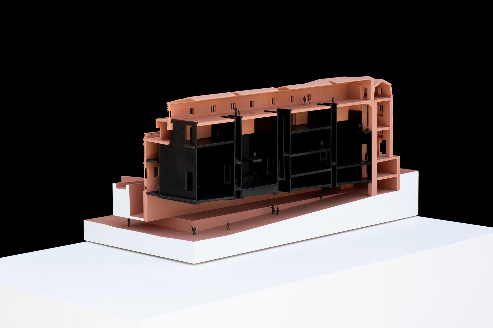
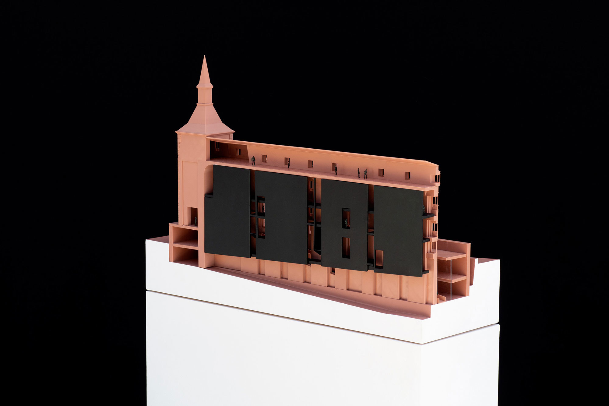
An iconic building rooted in the past, the Hall of Realms presently remains invisible. Our thesis subverts the Prado Museum extension through a series of interventions that challenge the existing characteristics of a building weighed down by its own historic status.
Formerly a 16th-century private seat of power destined to become a public container of culture, the Hall of Realms competition falls into the all too familiar trope of a palace-to-museum conversion that produces a building we know how to occupy and relate to. By unsettling the typology’s inherent qualities, this project reorients an expected encounter into an unforeseen discovery.
Altering architectural features such as symmetry, access, circulation, and ground, the project forces us to rethink our relationship to the past. Instead of reinforcing old ways of inhabiting cultural institutions, these changes provoke different ways of occupying and moving through the space of the museum.
Transmuting the building to obscure the distinction of an addition, our thesis is at once old and new, (un)obtrusive in its subversion, uncanny in its differences.
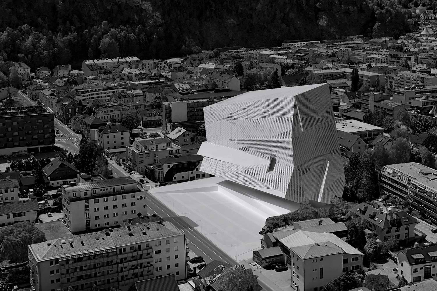
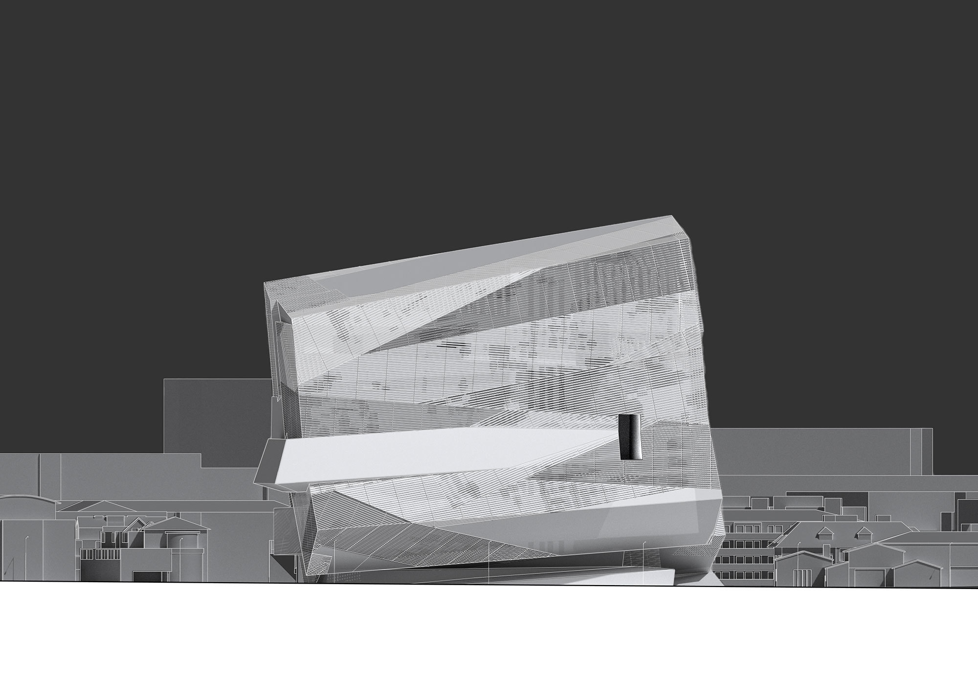
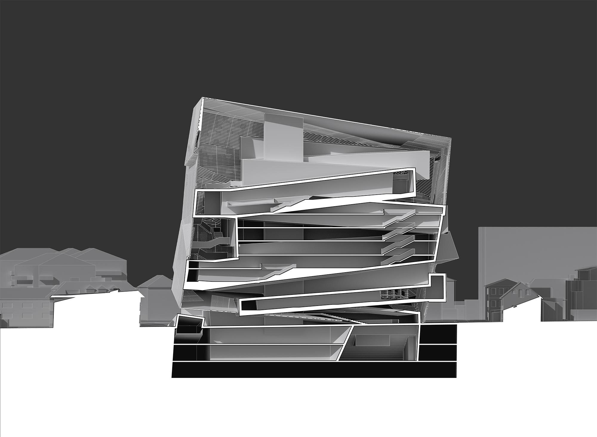
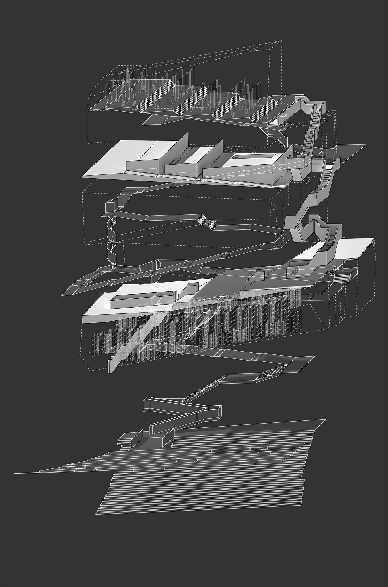
Heff Jin
Shape Shift
Advisor: Russell Thomsen
This thesis explores the idea of excessive circulation space in a bureaucratic building. It challenges the historical assumption that such buildings have always existed in the background of urban space and that they are primarily driven by concerns for efficiency. The project is developed as a response to the New Salzburg town hall competition, which seeks to demonstrate a new possibility for the relationship between government and the public. Unlike the Hohensalzburg, a prominent, historical fortress that stands above the city, isolated from the public that it serves, the New Salzburg town hall offers an alternative architectural response. Building on precedents like the Dutch Embassy by OMA, the extension to the Jewish Museum by Libeskind and the VitraHaus by Herzog & de Meuron, the project introduces an excess of circulation to promote accessibility and increased interactions between the government workers and the public. Instead of an iconicity of isolation, the project proposes a new form of public(city), enabled by an excess of movement and the serendipity of exchange. Instead of falling into the background as a remote symbol of power and segregated surveillance, the new building is integrated into the city and the surrounding neighborhood, extending the life of the street into the building.
Pasinee Jiemchareonying and Kevin Lee
Advisor: Kristy Balliet
Our thesis explores a way in which graphic representations can construct a spatial typology that accommodates varying degrees of social interactions. Located in Culver City, our Apple headquarters use line types to articulate and define different kinds of workspaces, fitted for varying degrees of collaboration, enclosures, and exposure.
As a response to the evolved working culture, the project engages a range of visual effects, spatial relationships, scale, and orientation to define the quality of the space, as well as the degree of connection between one adjoining space to another. As staff return to offices after the lockdown, we believe that office design needs to take into account the new normal of working culture, where some staffs return to their 9-5, five days week schedule while the others may occasionally work remotely and use office space as an opportunity to check in with their colleagues. Hence, our Apple headquarters uses strategies derived from the graphic representation of walls and columns to construct various spatial typologies for workers to return to office.
In relation to the panopticon where the center is the viewer surrounded by the view. Our take of the panopticon shifts the top-down structure in an institution, where one feels interrogated by the constant gaze, to an environment where individuals seek social interaction and choose to be seen.
Chengyu Zhang
Chengyu Zhang
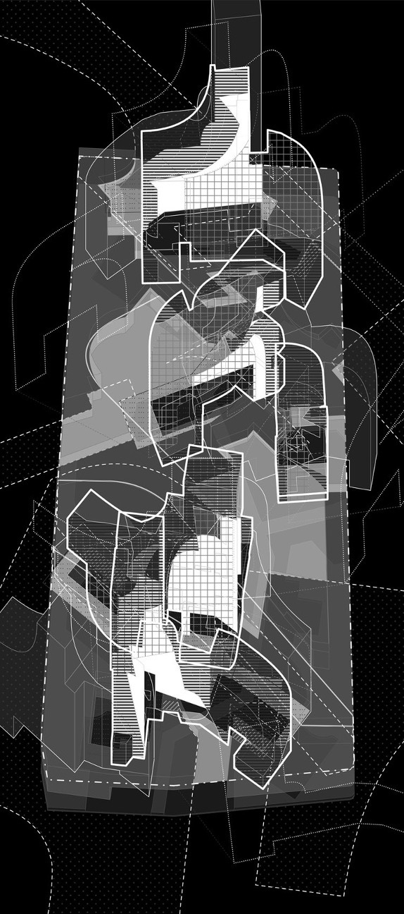
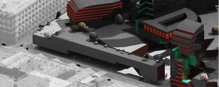
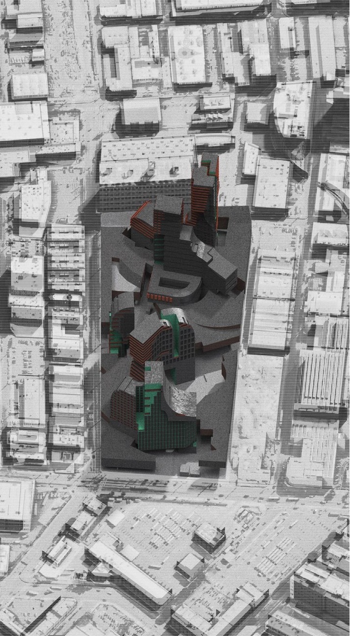
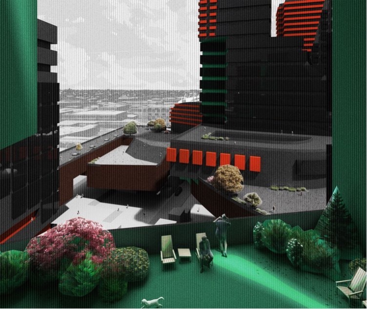
MEGABLOCKS
Advisor: Peter Testa
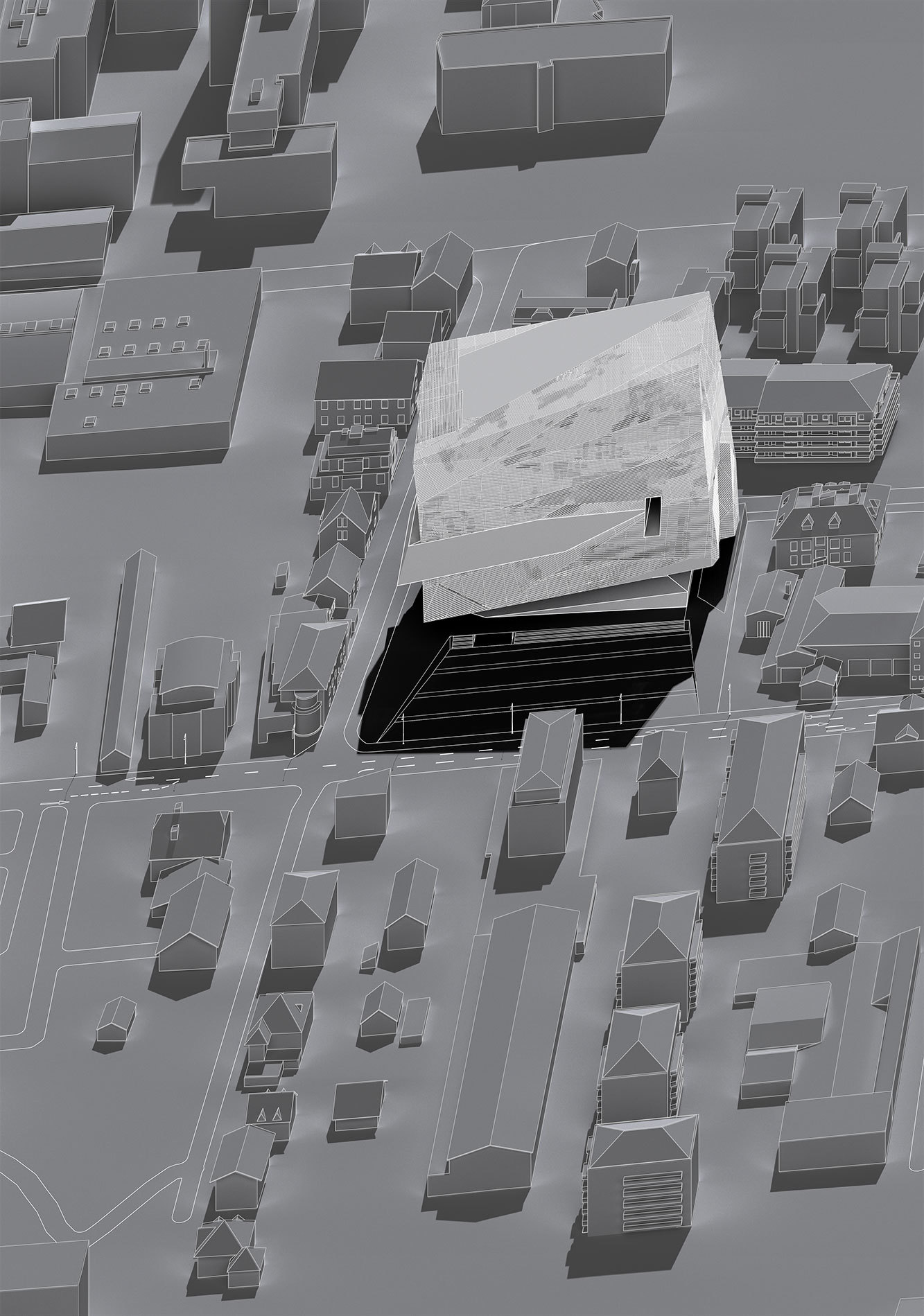
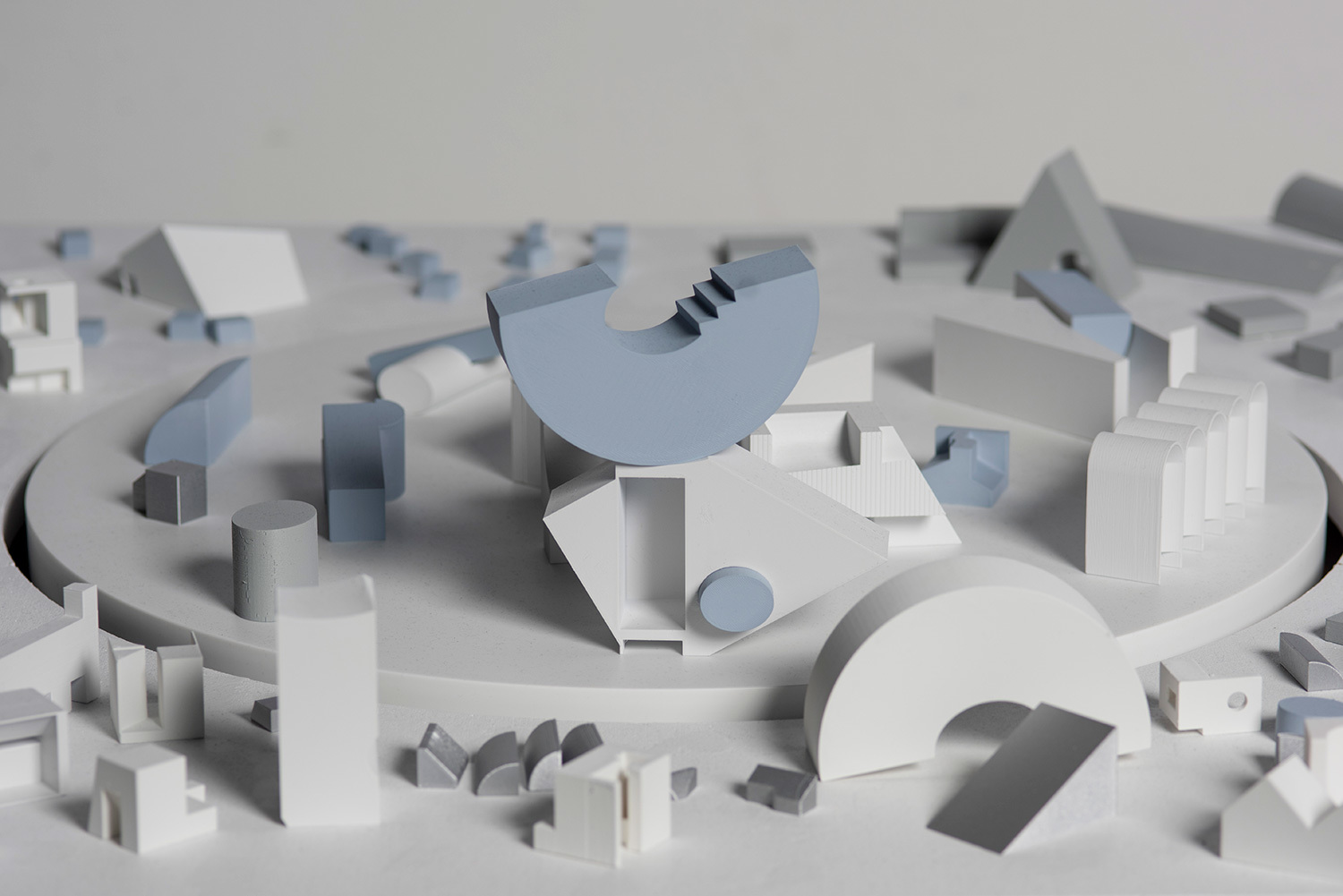
Megablocks, a metropolitan scale intervention, addresses the contingencies brought about by rapid urban development, growth, and change. As a discontinuous exception, it will become a city's new landmark in a counter position. Megablocks can be composed on various scales depending on the distribution and interweaving complexity of the program. Its potential is a positional play between volume and shape. There is always a sidedness and spatiality, which is never what you expect.
Megablocks are also the landscape of the metropolitan. Unlike the fixed and commercialized private environment, Megablocks can redefine as a space where meaning can be generated according to the original intimate relationship between the inhabitant and the surrounding territory. The thesis project proposes a series of a purist and unique Megablocks that aims to reconfigure and enrich our understanding of life, tradition, scale, nature, and city. The site is the massive 6 am mixed-use development (650,000 sq feet) in the arts district of Los Angeles.
Such a massive scale at such a critical position in the city requires a degree of complexity, and experiential diversity, at the same time that it invites some formal coherence. This is why we could apply the Megablocks idea and Kazuo Shinohara's architectural vocabulary of forms so effectively on this site. As an architectural mechanism, the thesis project proposes a syntax capable of engendering a series of irrational appearances different from functional logic. It focuses on developing new spatial meaning between non-correlated parts and creates a meaning space generator activated by human activities in space. The inner connections remain invisible, which explains the Megablocks' external irrationality. These parts are placed and organized in a seemingly casual manner to highlight their formal quality further distinguishing the Megablocks as a new metropolitan form.
—
Best projects:
Piyi (Phoebe) Yao and SinChuen Cheng
Esin Karaosman
https://drive.google.com/drive/folders/1g7NGu_3OTSsef60TucoXu6-TYCmvhCzT?usp=sharing
Zane Mechem
https://drive.google.com/drive/folders/18Tj3ywy5fjfCmV6mR1RLiQue__rdQBHK?usp=sharing
Lingjia (Adam) Wang & Yunbin Wang
Heff Jin
https://drive.google.com/drive/folders/1-rmBDkBeilmLW8nMw7I1pkDDAx76u_yR?usp=sharing
Tamara Birghoffer and Kendall Man
https://drive.google.com/drive/folders/1XlUwWsPO9EvKs_56aEe0cJxoameLpDSs?usp=sharing
Pasinee Jiemchareonying and Kevin Lee
https://drive.google.com/drive/folders/1d3Y_RfFwVFLcnx-_037L3QPx8BzcPPPT?usp=sharing
